Candles That Speak: The Power of Thoughtful Design in Building a Brand
Crafting an Iconic Look for Daniel’s Candles
Great design begins with the details. It’s in these subtle nuances where brands come to life, evoking emotion, and telling a story that resonates with their audience. For Daniel’s Candles, our mission was clear: create a visual identity that balances masculine sophistication with inviting approachability.
When we embarked on this journey, we knew the brand’s essence was rooted in more than just candles; it’s about the unforgettable scents that transport you to cherished memories and serene moments. Every part of the design process was meticulously geared to embody this.
The Logo: A Study in Elegance
The foundation of any great brand is its logo, and Daniel’s Candles is no exception. The final logo combines custom typography with classic fonts like Cochin and Professor to exude a refined yet approachable feel. The flowing script of “Daniel’s” feels personal, while the bold serif in “Candles” grounds the logo with a sense of timelessness.
This design is more than just visually appealing—it’s functional, versatile, and speaks to the brand’s audience. Whether gracing the label of a candle jar or showcased on marketing materials, the logo ensures Daniel’s Candles is instantly recognizable.
Inspiration Meets Innovation
Drawing inspiration from modern luxury and timeless aesthetics, we sought to create a look that felt both familiar and fresh. The mood board (below) guided our approach, with elements of clean minimalism, artisanal craftsmanship, and subtle masculinity woven throughout. This thoughtful curation ensured every design decision reflected the brand’s core values.
Concept Development: Exploring Possibilities
Behind every polished design lies countless iterations and explorations. From initial sketches to refined mockups, our concept development phase was crucial in determining what felt authentic to the brand. Each idea was carefully evaluated to ensure it aligned with Daniel’s vision of creating an elevated yet accessible product line. You can see a few of the logo mockups, below.
Packaging That Speaks
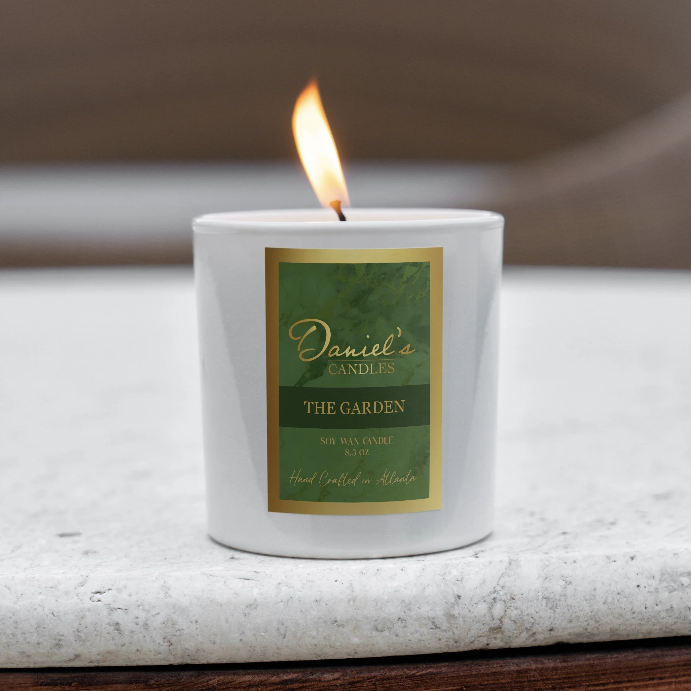
Packaging plays a pivotal role in connecting customers to the product. For Daniel’s Candles, the labels are a harmonious blend of rich colors, gold accents, and modern typography. Each scent features a unique palette that mirrors its essence, while maintaining a cohesive brand identity.
We gave Daniel’s Candles a few label concepts in response to the finalized logo. They took one of these concepts and developed it into the labels you see above. We love how they turned out.
A Look Ahead: Launching in Early 2025
As Daniel’s Candles prepares for its official launch in early 2025, we’re excited to see this vision come to life. The brand’s identity is more than just visuals—it’s an experience. From the first glance at the logo to lighting the candle at home, every moment is infused with care and intentionality.
Stay tuned for the launch announcement, and in the meantime, let the design inspire you. Because great design isn’t just about what you see—it’s about what you feel.


