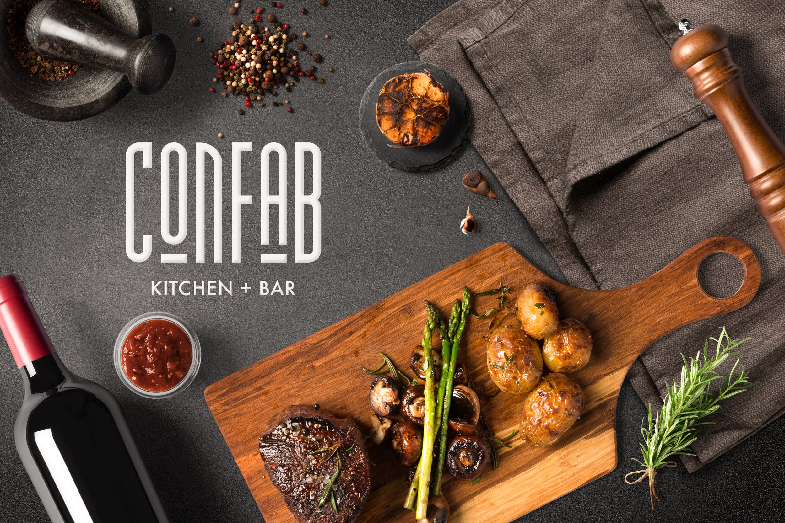
APPROACHABLE LUXURY
Branding | Brookhaven, GA
Client: Confab Kitchen + Bar
Services: Logo Design, Palette Design
Project Type: New Restaurant
Completed: Summer 2024
This project presents the creation of a distinctive and inviting brand identity for CONFAB, a new restaurant on Atlanta's Upper East Side. Inspired by European dining culture, CONFAB was envisioned as a casual yet upscale gathering spot for guests to eat, drink, and engage in lively conversation. The name “confab,” meaning “familiar talk or conversation,” perfectly reflects this vision..
At the heart of CONFAB’s visual identity is its logo suite, designed to reflect the restaurant’s unique blend of sophistication and warmth. We developed three scalable logo variations: the Primary Logo, the Secondary Logo, and the Submark Logo, each tailored to different applications while maintaining a cohesive visual identity.
The Primary Logo serves as the cornerstone of the brand, blending European-inspired typography with structured lines and approachable curves. Underlined vowels in “confab” emphasize pronunciation, adding an interactive and curious element to the design. This combination of boldness and charm ensures the logo stands out while remaining inviting.
The Secondary Logo simplifies the primary design for use in spaces where a full logo may not be practical. Meanwhile, the Submark Logo distills the brand’s identity further into a minimalist icon, perfect for use on smaller assets like packaging, merchandise, and social media. Together, these variations ensure the brand is adaptable without losing its distinctive character.
A Color Palette Inspired by Whimsy and Sophistication
The color scheme for CONFAB draws inspiration from the vibrant yet harmonious tones found in Wes Anderson’s films, which are loved by the client. AMD combined playful hues with earthy neutrals to create a palette that mirrors CONFAB’s balance of energy and elegance.
Two grounding neutrals—Mushroom and Black Pepper—provide a sophisticated base. These are complemented by fresh, cool tones like Ocean Water and Curacao, along with warm, lively accents such as Mustard and Pomelo. This carefully curated palette extends across all aspects of the brand, from menus to interior décor, creating a cohesive and dynamic visual experience that feels both refined and approachable.


